Presenters:
Johan Haarberg: Senior Advisor to the SAR Executive Board.
Johannes Kretz: SAR Executive Board Member and Head of the Artistic Research Center (ARC) at mdw – University of Music and Performing Arts, Vienna.
Linnea Langfjord Kristensen: Communication Officer at the Society for Artistic Research.
Casper Schipper: Managing Team of the Research Catalogue.
Daniele Pozzi: Managing Team of the Research Catalogue.
Fabrício Fava: Integrated junior researcher at SAR Portal Partner i2ADS, University Porto.
*The full list of expositions referenced in this seminar is listed at the end of the blog.
Earlier this month, as part of our Research Catalogue seminar series, we focused on design and structure in the creation of an exposition, which brought together different perspectives on how expositions are shaped through their design and form. Both conceptual framing and concrete examples were shared.
The seminar opened with Johan Haarberg, who situated artistic research within a broader research context; Referring to the Frascati Manual, he outlined key criteria for research, such as being novel, creative, uncertain, systematic, and transferable, and pointed out that artistic research clearly operates within these conditions, even if aspects like reproducibility remain complex.
From there, he shifted to the Research Catalogue itself, framing it as a platform for documenting research processes and outcomes. Rather than prescribing a fixed format, he emphasised its openness: there are no strict rules regarding content, methods, or documentation. This places responsibility on the researcher to decide what to show and how to show it.
He then introduced a series of guiding questions:
- What aspects of the research do you want to share?
- Context, methods, challenges, results, failures?
- How can these be demonstrated using the RC’s media capabilities?
- Who is the reader, and how should they encounter the work?
Importantly, he also pointed to a very practical starting point: the personal media repository. Building and organising this from early on in a research project can shape how an exposition eventually comes together.
The discussion was then continued by Johannes Kretz, who moved into questions of structure. Picking up directly from Johan’s framing, he asked how research content can be translated into what he called “visual metaphors.”
He described a range of possible structures:
– a linear text (like a book or stream of thought)
– hierarchical structures (like trees or chapter systems)
– maps, where users navigate spatially
– labyrinths, where exploration and uncertainty play a role
– matrices, where multiple dimensions can be compared
– or even more complex systems like rhizomes or networks
Rather than presenting these as categories to choose from, Johannes framed them as ways of thinking about how information is organised and experienced.
A key point he returned to was that structure shapes behaviour. A map invites orientation and choice while a labyrinth invites exploration and uncertainty. Neither is inherently better, but each creates a different kind of engagement.
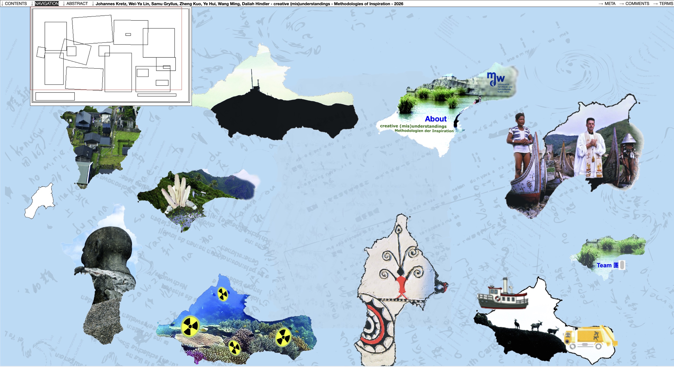
He also demonstrated this through concrete examples, including his own project structured as an “island map,” where users navigate between different conceptual areas, and a matrix-based exposition where two axes structure how content can be read.
Towards the end of his section, the discussion focused on questions of navigation, citation, and reader experience. Together with Casper Schipper, he addressed how specific parts of an exposition can be referenced - showing how URLs in the RC can capture exact positions within a page, and how navigation can function almost like “teleportation” between points.
This led into a broader reflection:
- How do readers actually move through an exposition?
- Can they find what they are looking for?
- Do they understand how long it will take to explore?
Johannes suggested that offering some kind of overview or even guidance can help readers orient themselves, especially in more complex or non-linear structures.
The seminar then shifted to Linnea Langfjord Kristensen, who focused on (visual) communication and reader experience, translating structural ideas presented by Johan and Johannes into design principles.
She returned to the same initial questions of what is your research, how do you communicate it, and who is it for, but now from a visual perspective. From there, she introduced core principles such as visual hierarchy, spacing, contrast, scale, and modularity as tools for shaping how content is read.
A central idea was modular thinking: instead of large blocks of text, expositions can be structured into smaller units, either conceptual, contextual, reflective, media-based and so on. On web, readers tend to behave differently from readers of books. They scan, look for anchors, and quickly assess relevance and time investment. This makes clarity, structure, and visual cues essential.
Navigation was another key focus. Linnea framed that while something like disorientation can be a potential artistic strategy, it must be intentional. Otherwise, readers simply disengage. Tools like menus, links, popovers, and introductions to navigation logic can help guide the reader, if that is the intention.
She also addressed the use of media, highlighting the consideration to make it function as knowledge production rather than decoration. This includes practical considerations, such as breaking long videos into smaller segments and embedding them where they support specific arguments.
Finally, she discussed rhythm and cognitive load, highlighting how layout affects the reader’s ability to engage. Alternating text and media, using white space, and managing page length all contribute to a more sustainable reading experience.
Her presentation concluded with a broader reflection: design choices shape not only clarity and accessibility, but also the affective experience of an exposition: whether it feels immersive, fragmented, playful, or participatory.
The final part of the seminar focused on examples, presented by Daniele, Casper, and Fabrício, each showing how these ideas are realised in practice.
Daniele presented an exposition that works through layering different types of material consisting of images, sound recordings, and multiple kinds of text. He highlighted how the work distinguishes between immediate notes, associative reflections, and more analytical writing, each with its own visual treatment. The exposition combines a largely linear narrative with the possibility of more exploratory reading, allowing users to either follow or skim through the material.
Casper then showed an example focused on process and accumulation. The exposition functions almost as an archive of experiments, where each experiment exists as a small, self-contained unit. Through visual markers and icons, the reader gains an overview of a large body of material, including both successful and unsuccessful attempts. This approach demonstrates how expositions can be built incrementally, without requiring a fully fixed structure from the start.
Finally, Fabrício presented a different use of the Research Catalogue: the creation of a conference website. His example demonstrated how the RC can be used beyond artistic research documentation, functioning as a flexible design tool. He walked through the process of creating the conference website for the 16th. SAR International Conference 2025 - from structuring content and sketching layouts to working with the block editor and adapting to technical constraints. His presentation also highlighted how design principles such as alignment, contrast, and repetition can be applied within the platform, even when working within its limitations.
Together, these examples grounded the earlier discussions, showing how structural thinking, visual design, and media integration come together in practice.
The seminar closed by returning to a shared understanding: Expositions are themselves research objects that produce unique knowledge through their forms.
* Expositions shared in the seminar:
https://www.researchcatalogue.net/view/760532/918401
https://www.researchcatalogue.net/view/1673421/1673422
https://www.researchcatalogue.net/view/80218/91677/0/1506
https://www.researchcatalogue.net/view/81476/149707
https://www.researchcatalogue.net/view/3403516/3403517
https://www.researchcatalogue.net/view/643746/647656/2
https://www.researchcatalogue.net/view/3294092/3294095
https://www.researchcatalogue.net/view/883787/883788
https://www.researchcatalogue.net/view/883787/895793
https://www.researchcatalogue.net/view/3512750/3512754
https://www.researchcatalogue.net/view/1073575/1073576
https://www.researchcatalogue.net/view/1305902/2323750
https://www.researchcatalogue.net/view/1955415/1955416/0/0
https://www.researchcatalogue.net/view/396330/546642
https://www.researchcatalogue.net/view/1571956/1571957/0/0
https://www.researchcatalogue.net/view/1576308/2474636
https://www.researchcatalogue.net/view/643746/652150
https://www.researchcatalogue.net/view/1576308/2474634
https://www.researchcatalogue.net/view/829675/1122602
https://www.researchcatalogue.net/view/3782035/3782043
https://www.researchcatalogue.net/view/2951879/4072875
https://www.researchcatalogue.net/view/2419148/2959470
https://www.researchcatalogue.net/view/2045845/2045846
https://www.researchcatalogue.net/view/1305902/2221789
https://www.researchcatalogue.net/view/462390/462391
https://sar2025.i2ads.up.pt/
https://www.researchcatalogue.net/shared/c252dbfea70a249a92a88b4f772ee0b2